Other modern/experimental/docorative examples


Bauhaus
ITC Bauhaus is a type of its time – of the 1970s – and interestingly it has many contemporaries that reveal a certain family resemblance. Herb Lubalin’s ITC Ronda, released in 1970, can perhaps be listed in the same breath, even though it distinguishes itself from the group through its less quirky and instead rather elegant approach in the upper cases. At the time Lubalin was working on another typeface inspired by geometric shapes with his partner Tom Carnase: ITC Avant Garde, based on the logotype from the magazine of the same name. Designed and expanded to a family of several weights between 1970 and 1977, it has maintained great popularity up until today and can be found in countless logos.

Other geometric San Serif Type Faces used today
Agency FB
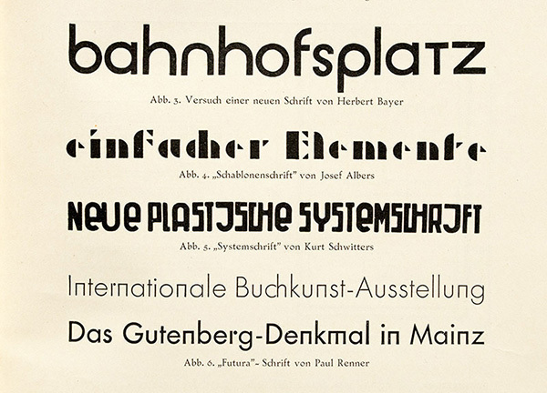
Architype Albers
Architype Bayer
Architype Renner
Architype Schwitters
Architype van der Leck
Architype Van Doesburg
Avenir (typeface)
Bank Gothic
Bauhaus (typeface)
Bernhard Gothic
Braggadocio (typeface)
Brandon Grotesque
Century Gothic
Dead History
Drogowskaz
Erbar (typeface)
Eurostile
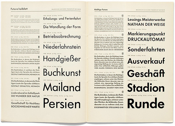
Futura (typeface)
Gotham (typeface)
Gridnik
Handel Gothic
ITC Avant Garde
Kabel (typeface)
Lexia Readable
Neo Sans
Neutraface
Neuzeit S
Nobel (typeface)
Red Circle (typeface)
Spartan (typeface)
Squarish Sans CT
Tasse
Toronto Subway (typeface)
Tratex
Twentieth Century (typeface)
VAG Rounded
No comments:
Post a Comment