Monday, February 8, 2016

Brief History

The mid-1920s, a period in German history with exceptional innovation in engineering, in the arts and in design. In particular, the years between 1925 and 1930 produced several ideas that were new to the world – among them a new concept in type design: the geometric sans serif.

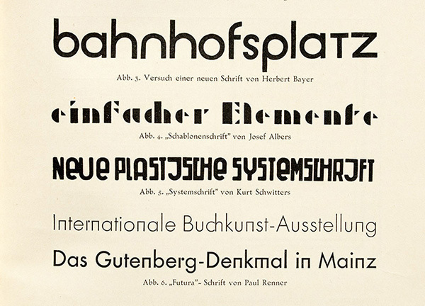
For graphic designers beginning to experiment in type design, a geometric or modular typeface is a natural starting point. Illustrator and other programs offer a simple collection of elements such as circles, squares, and triangles which can be combined to create a passable alphabet. This is the same route many designers took when dissatisfied with the limits of commercial fonts at the time. They twisted and distorted each character to fit into a few simple, incredibly strict rules of construction. Invariably this produced a wide range of exotic letterforms, some more legible that others.

There are certain elements that help viewers understand how to make them more readable, work effectively and be visually consistent.

Balance


Widths


The Joins


The S


Stroke Widths


Overshoots


Spacing


These examples are only an outline of the issues you will face when designing type, but will draw your attention to the most common mistakes. A strict set of rules at the beginning can produce some very interesting ideas, but they need to be flexible. This will not only to make your type work better, but will help differentiate yours from the others being churned out every day. The simplest rule to remember is: trust your eye more than the grid.

Sunday, February 7, 2016

Geometric Type Designers

Herbert Bayer was an Austrian American graphic designer, painter, photographer, sculptor, art director, environmental and interior designer, and architect, who was widely recognized as the last living member of the Bauhaus and was instrumental in the development of the Atlantic Richfield Company's corporate art collection until his death in 1985.

Herbert Bayer's 1925 experimental universal typeface combined upper and lowercase characters into a single character set.


This experimentation led to other typeface designers to think outside the box geometrically as well.

Hunter Middleton and Gerry Powell combined ideas to create a stencil like font. This font consists of only capital letters with rounded edges and thick main strokes with breaks in the face to give it the appearance of the stenciled alphabets used on boxes and crates. Stencil became very popular over time and is still used today.


Wim Crowell is a Dutch graphic designer, type designer, and typographer. In 1967 he designed the typeface New Alphabet, a design that embraces the limitations used by early data display screens and phototypesetting equipment, thus only containing horizontal and vertical strokes geometrically.


Thursday, February 4, 2016

More Examples


Comparison of Universalschrift by Herbert Bayer, Schablonenschrift by Josef Albers and Systemschrift by Kurt Schwitters with Paul Renner’s Futura in the critical article “Zweifel” (doubt) by Heinrich Jost in Klimschs Jahrbuch, vol. 21, Frankfurt/Main 1928<


Type specimen of Erbar-Grotesk (Ludwig &amp; Mayer), Baustein-Grotesk and Lichte Koralle (both Schelter &amp; Giesecke) in capital letters—note the capital ‘ß’—Futura (Bauer) and Grobe Kabel (Gebr. Klingspor) in Klimschs Jahrbuch, vol. 22, Frankfurt/Main 1929.
Early Bauer type specimen of Futura.


Specimen of Elegant-Grotesk in medium and inline weights in Klimschs Jahrbuch, vol. 23, Frankfurt/Main 1930.


Other modern/experimental/docorative examples


Bauhaus

ITC Bauhaus is a type of its time – of the 1970s – and interestingly it has many contemporaries that reveal a certain family resemblance. Herb Lubalin’s ITC Ronda, released in 1970, can perhaps be listed in the same breath, even though it distinguishes itself from the group through its less quirky and instead rather elegant approach in the upper cases. At the time Lubalin was working on another typeface inspired by geometric shapes with his partner Tom Carnase: ITC Avant Garde, based on the logotype from the magazine of the same name. Designed and expanded to a family of several weights between 1970 and 1977, it has maintained great popularity up until today and can be found in countless logos.


Other geometric San Serif Type Faces used today

Agency FB
Architype Albers
Architype Bayer
Architype Renner
Architype Schwitters
Architype van der Leck
Architype Van Doesburg
Avenir (typeface)
Bank Gothic
Bauhaus (typeface)
Bernhard Gothic
Braggadocio (typeface)

Brandon Grotesque
Century Gothic
Dead History
Drogowskaz
Erbar (typeface)
Eurostile
Futura (typeface)
Gotham (typeface)
Gridnik
Handel Gothic
ITC Avant Garde
Kabel (typeface)
Lexia Readable
Neo Sans
Neutraface
Neuzeit S
Nobel (typeface)
Red Circle (typeface)
Spartan (typeface)
Squarish Sans CT
Tasse
Toronto Subway (typeface)
Tratex
Twentieth Century (typeface)

VAG Rounded